Aloha
A gardening company in Wimmis and Interlaken who wanted a rebranding of their corporate identity as well as a new web presence.
The brief
Aloha requested a full rebranding of their corporate identity as well as a new web presence. They wanted their branding to reflect their values and their focus as a service provider.
They also wanted room to expand into sub-brands later.
The rebranding took place over a couple of months and worked towards a branding that communicated a more authentic and appropriate identity to potential clients.
One mark, five divisions
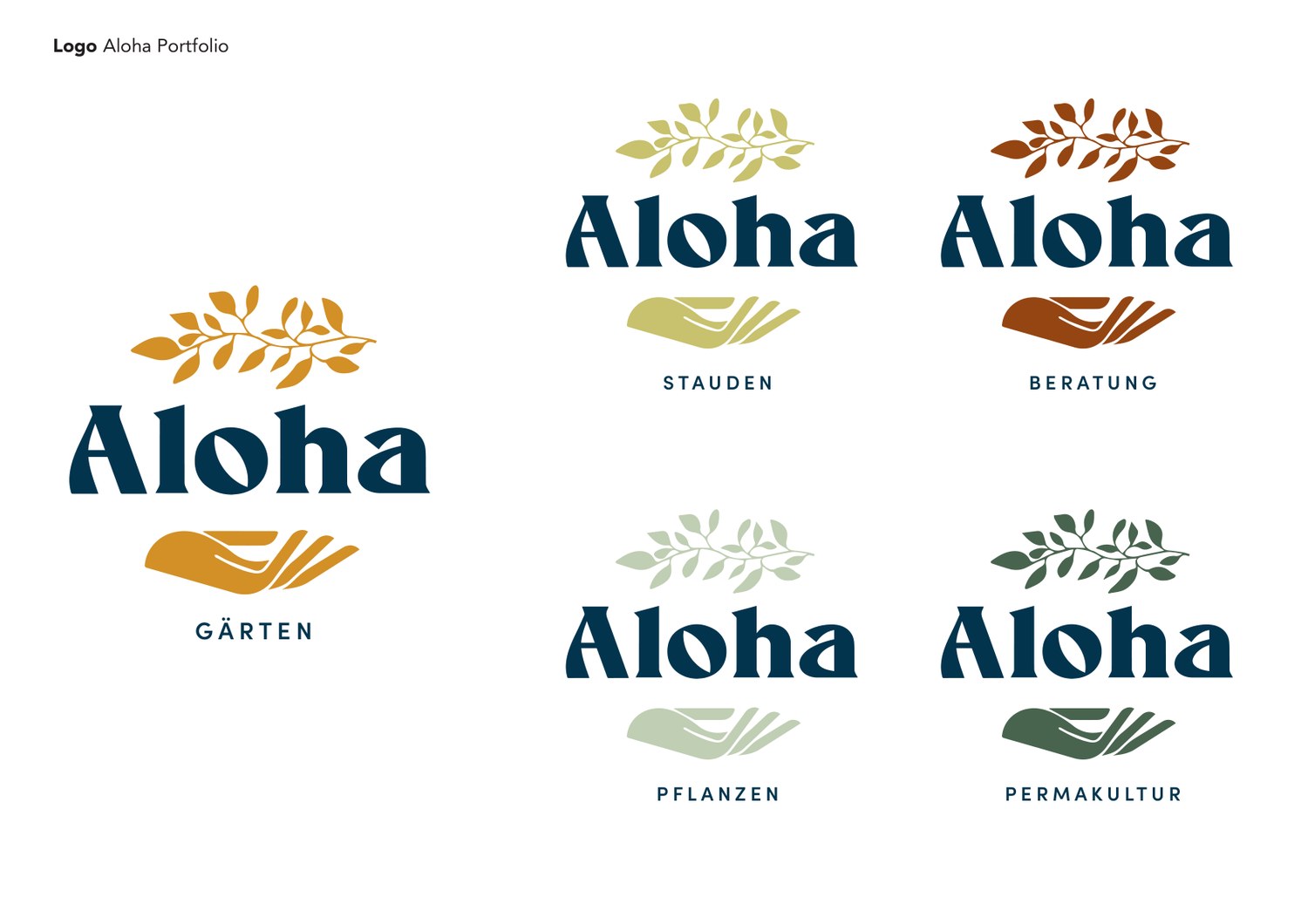
Aloha is not one thing. They design gardens, grow perennials, sell plants, advise, and do permaculture work. Each part talks to a different customer, and none of them needed a brand of its own.
So the mark stays fixed and the colour carries the difference: Gärten in ochre, Stauden in olive, Beratung in rust, Pflanzen in pale sage, Permakultur in deep green. Adding a division costs a colour rather than a redesign.
Colour and type
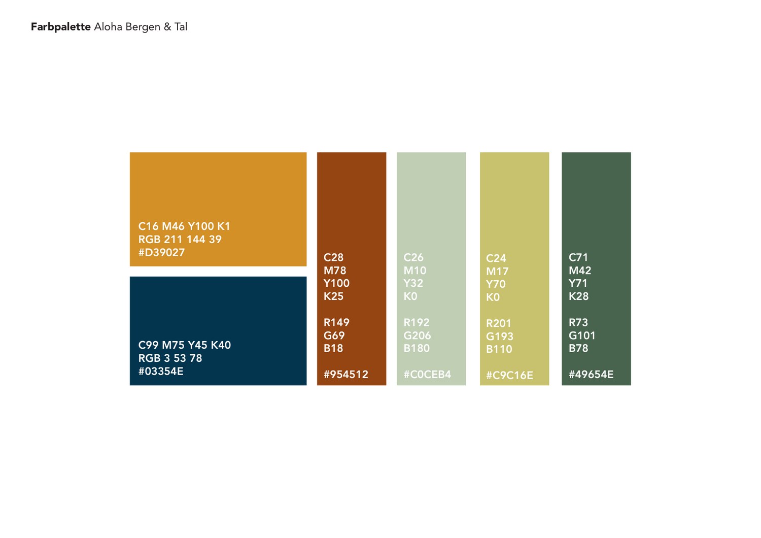
The palette we chose was called Bergen & Tal. Ochre and a deep navy carry the mark, with rust, sage, olive and forest green for the divisions.
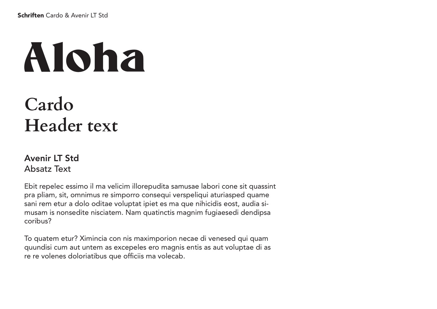
Cardo for headings and Avenir LT Std for body text.
The website
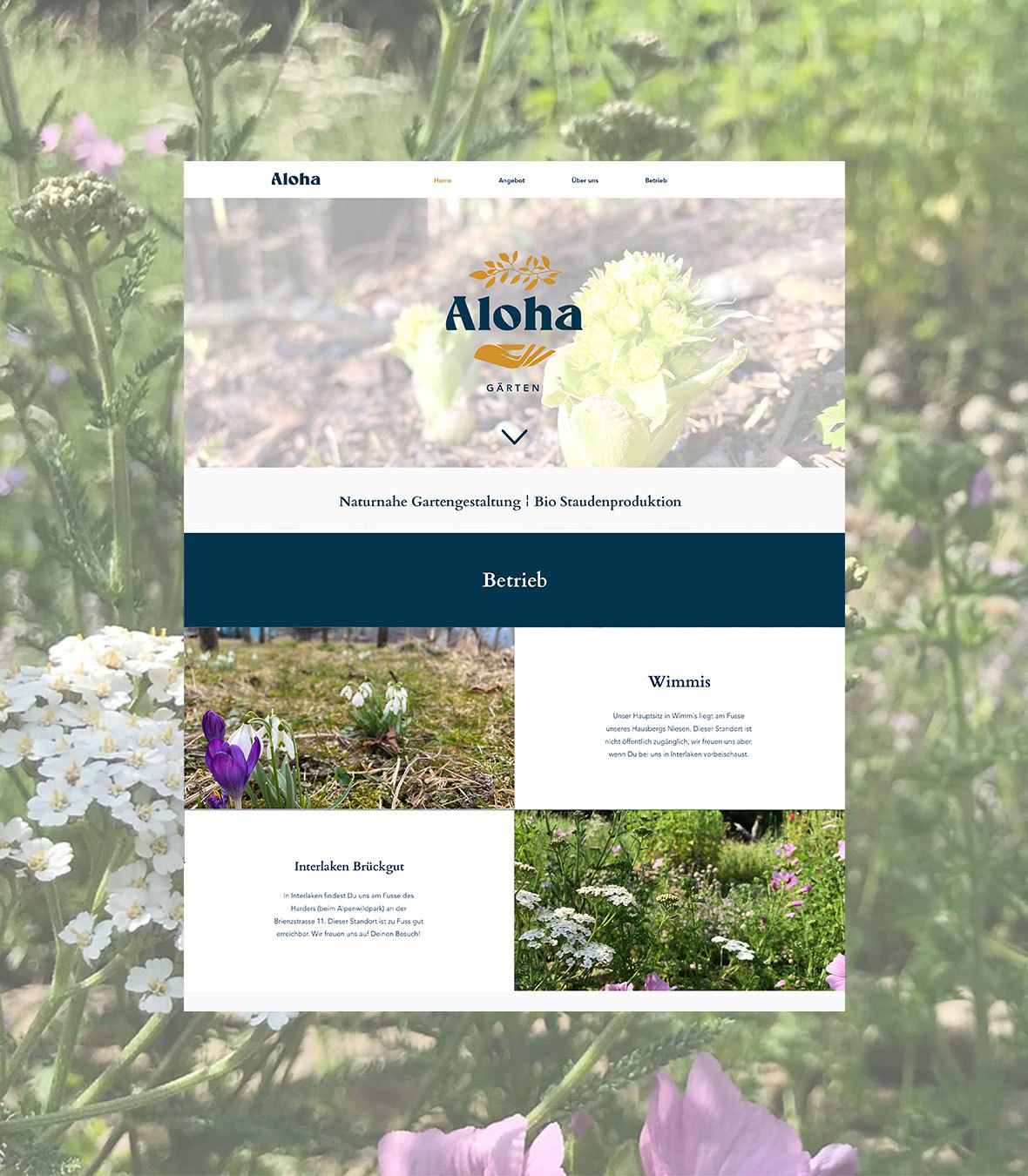
The website was designed with a minimalistic style so that the important information was at the forefront. They wanted to start simple with the ability to scale up and include pages for their educational offerings.
Overall it allowed for a good pairing between portfolio images and informative text. It is still online and still in use today.