The brief
Amberg Loglay orchestrates the logistics of large construction sites, combining software and consulting. Their clients range from property developers and investors to public bodies and contractors, and each of them needs something different from the same company.
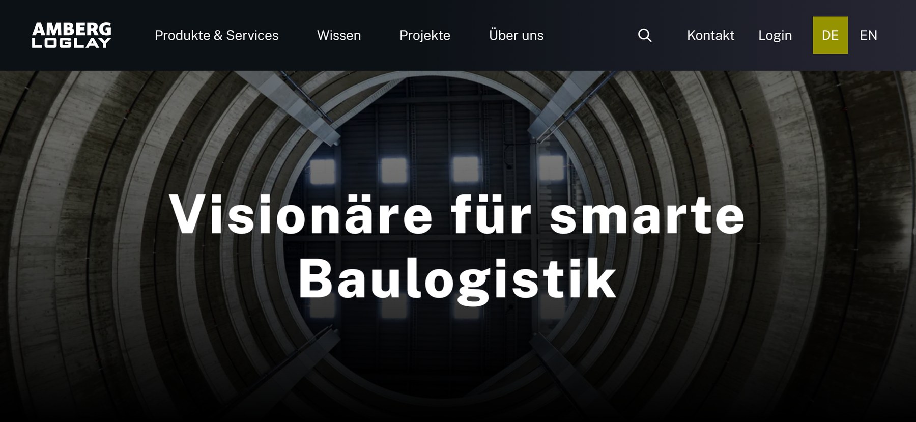
The old site felt a bit stale, combining different types of imagery without a clear relation to their brand. They wanted something modern that really represented their cutting-edge handling of logistics.
Our job was the rebrand, so we started at the beginning.
The workshop1 / 7
The thought processThe route
The route
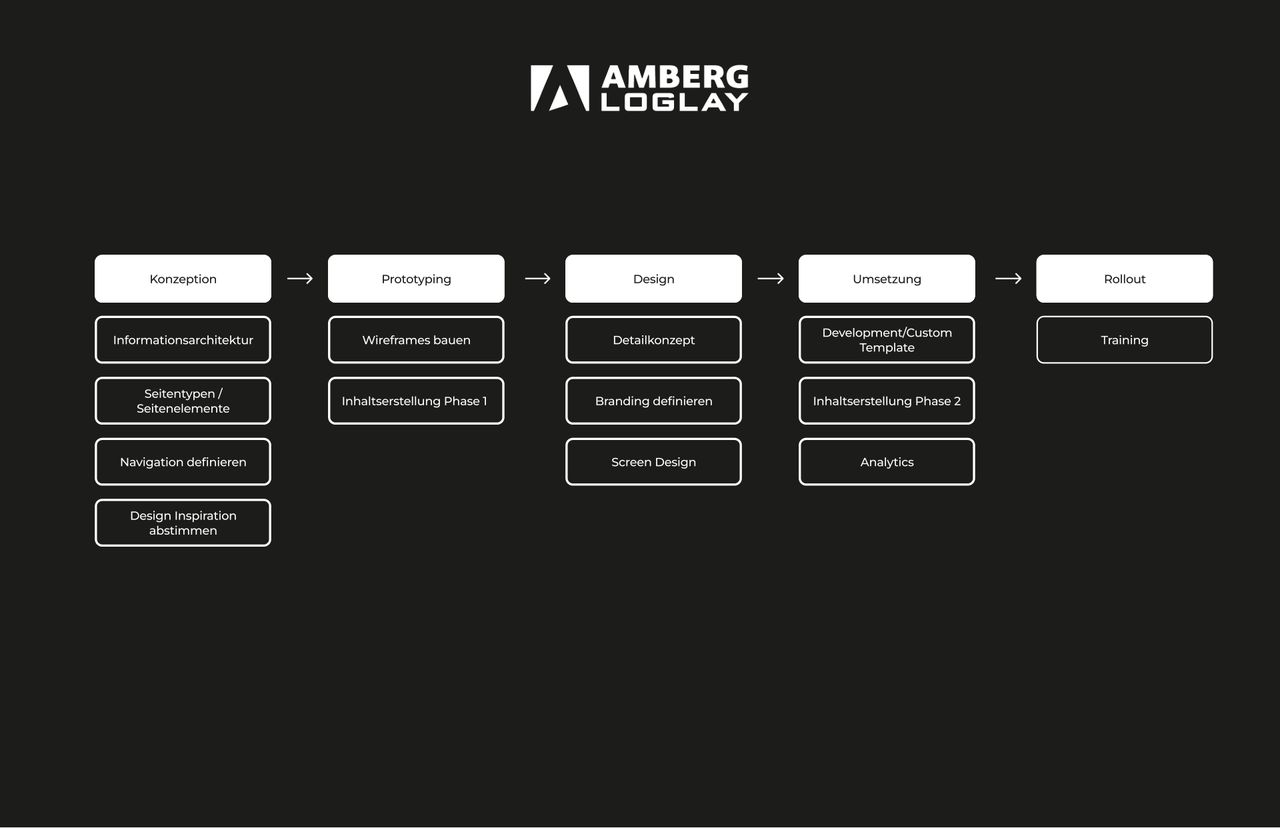
Concept, prototyping, design, build, rollout. Agreed at the start so everyone knew which decisions belonged to which stage.
The sitemap
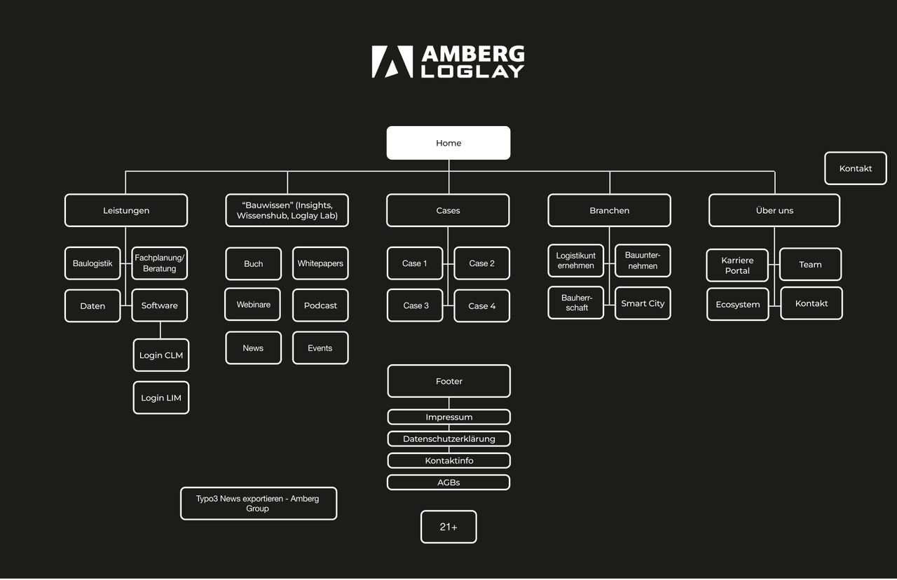
Every page of the site, mapped before a single screen was designed: services, sector pages, cases, the knowledge blog, and two separate client logins.
What it needed to do
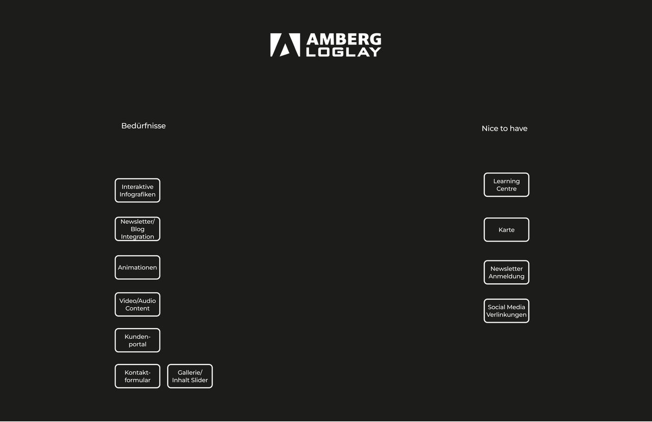
Interactive infographics, a newsletter and blog, animation, video and audio, a client portal. Separated into what the site needed and what would be nice to have.
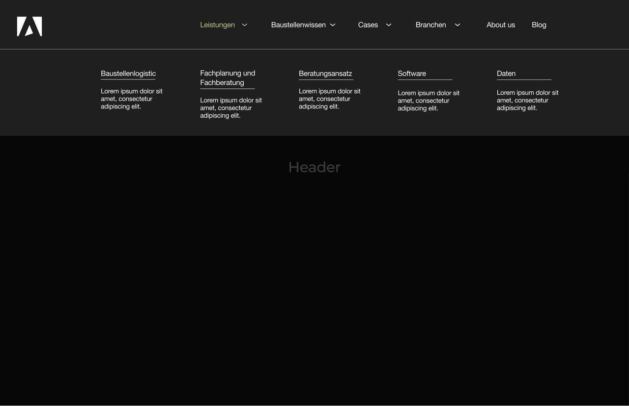
The navigation
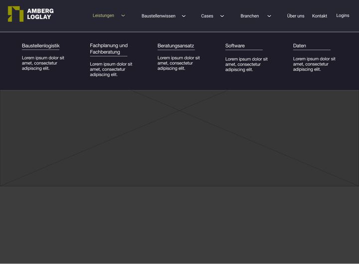
One worked example of how the menu behaves, with a section open. The rest of the menu states were built the same way.
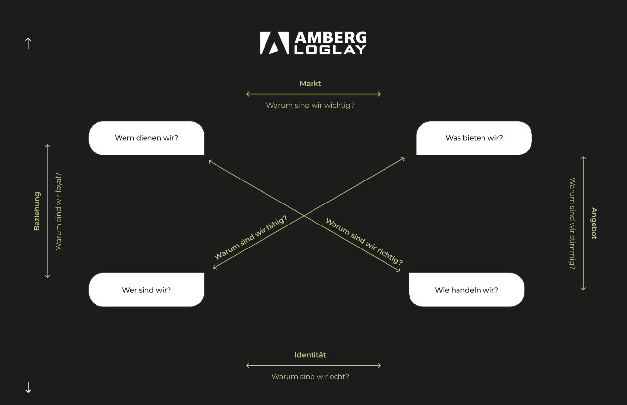
The framework
Four questions the brand had to answer, and the tensions running between them. Who we serve, what we offer, who we are, how we act.
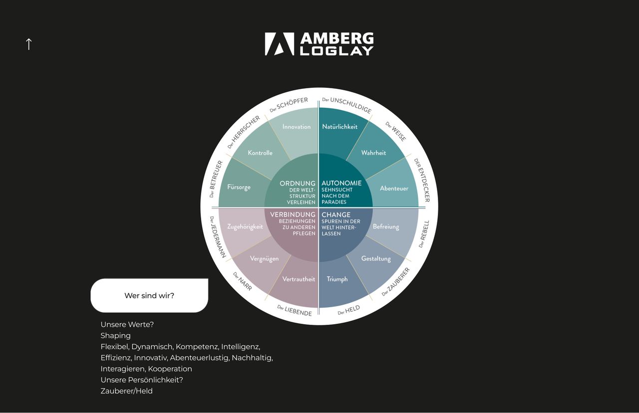
The character
Where the brand sits against a set of opposing traits. Deciding this on a wheel is faster than arguing about adjectives.
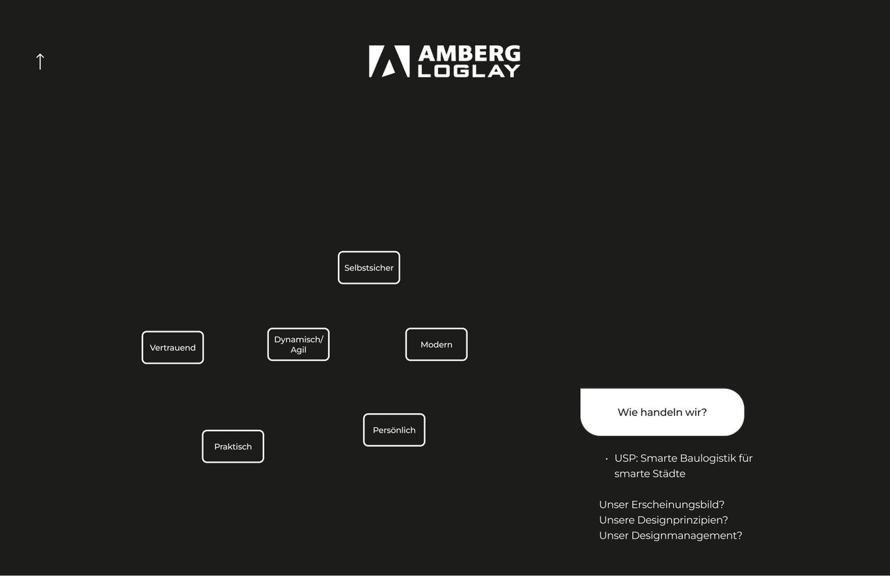
The tone
How the brand behaves in language, and the positioning line that came out of the session and still leads the site today.
Kicking off with the workshop
I find a lot of value in beginning a project with a branding workshop. There are often aspects of a brand that even people who have been in the company for years have blind spots about.
It gives me a consistent overview of everything I need going forward, whether the project is a website, a social media system or a logo redesign. Starting from the same baseline every time means I am not guessing later on.
So I work through the same points and the same methodology each time, even the ones that seem irrelevant in the moment. I can usually draw on them later in the project. The knowledge never goes to waste.
Every page, resolved
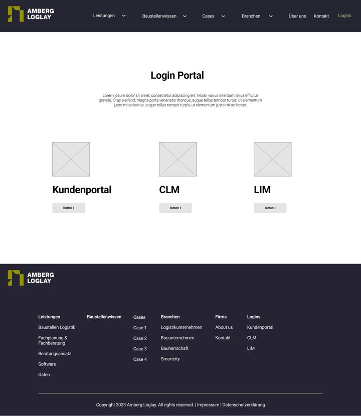
Twenty-fivewireframes.
Five of twenty-five
From structure to screen
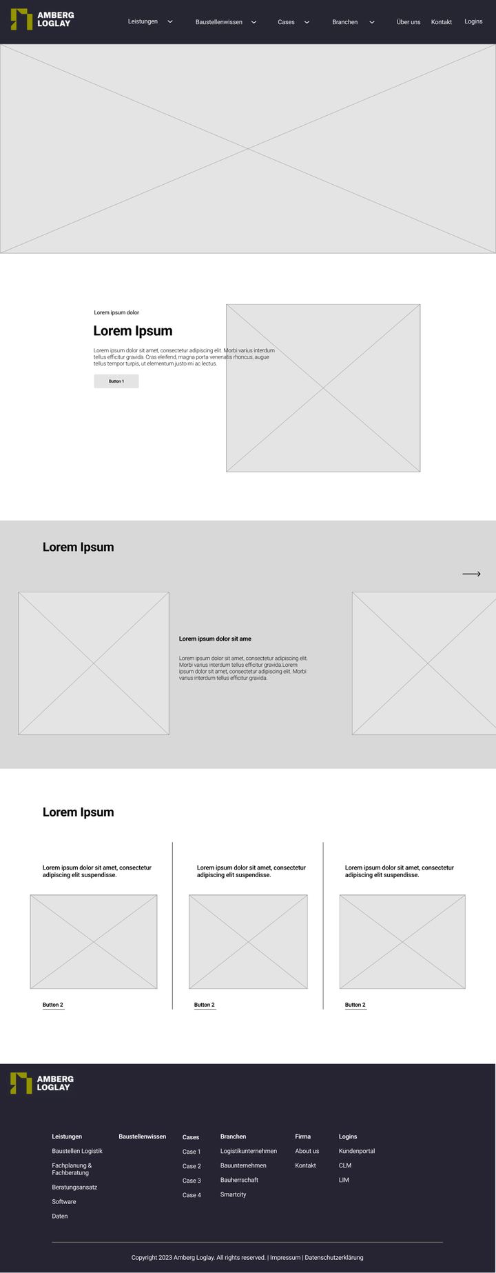
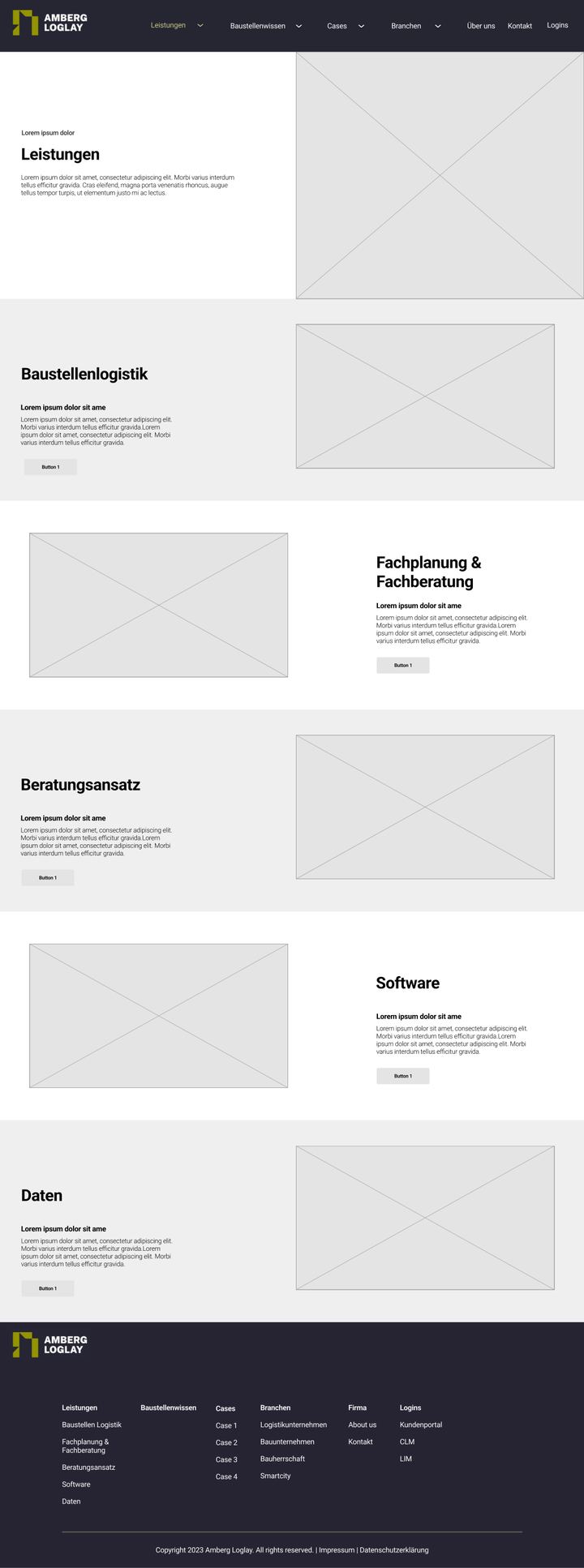
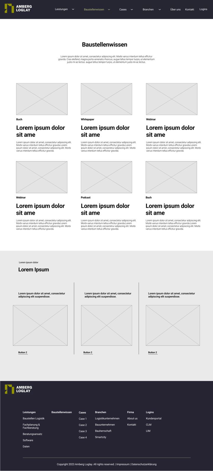
Twenty-five pages were wireframed at full length before any of it was styled: services, sector pages, case studies, the knowledge blog, the client login. Every page, every state, desktop and mobile.
I handed the wireframing off to a developer Redact brought on, after which my job was the art direction of the project. I worked closely with them to make sure the execution came as close as possible to what we had defined.
The social creative I established once the website had taken a clear direction, to keep the whole project cohesive under the new look and feel.
The site is live today at ambergloglay.com.